Grid is the framework for all the visual elements and typography. It’s fundamental to everything we design. No matter what device or medium you’re working with, the grid gives you just enough structure and guidance so you can focus on your creative idea.
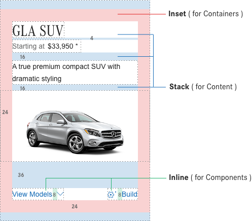
Principle 01
Divisions of two
At the core of the concept is the idea of divisions of two. This can be applied to most surfaces as a means to divide space into a helpful grid system. Dividing your space into 2, 4, 8, 16, 32, or 64 columns gives you the basis of the system with the purpose of helping you make decisions and organize your content.
The variety of screen sizes and pixel densities has continued to increase making the work of asset generation more complicated for designers. Utilizing an even number like 8 to size and space elements makes scaling for a wide variety of devices easy and consistent.
Principle 03
Spacial flexibility
Combining the 8-pixel mini unit and 2x idea together we have a robust system allowing ultimate spacial flexibility. This approach can be applied to fluid, fixed or hybrid grid layouts. All spacing between elements can be defined by the base unit. Consistent and replicated use of spacing ensures spatial rhythm between all content.
MB responsive grid specs
At the core of the concept is the idea of divisions of two. This can be applied to mos
Desktop 1440pt
Tablet Landscape
Tablet Portrait
Mobile
Design with the MB Grid
Below we present some applications in our digital space how different design components can be visualized using the 8-point Grid system. Unlike the 6-point or 10-point system, the 8-point grid benefits design in both flexibility and consistency perspectives.